Pre-Visit Research:
Formal Element: Colour
|
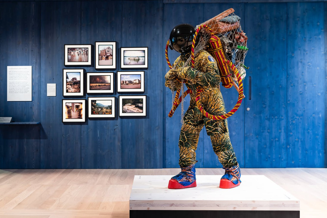
This piece of art, by Yinka Shonibare, which is called 'Refugee Astronaut', from the 'Being Human' exhibition, is one which I would be extremely interested in photographing to explore certain formal elements. The body of the astronaut explores the formal element of colour, as a variety of colours work harmoniously together, ranging from khaki green to gold. When photographing this artwork, I would like to focus on the contrast of the colours, which can also create a sense of emotion in my own work, due to feelings associated with certain colours. By also exploring with the aperture on my camera, I will be able to express the colour from different depths of field, and possibly applying fascinating effects.
|
Formal Element: Line
|
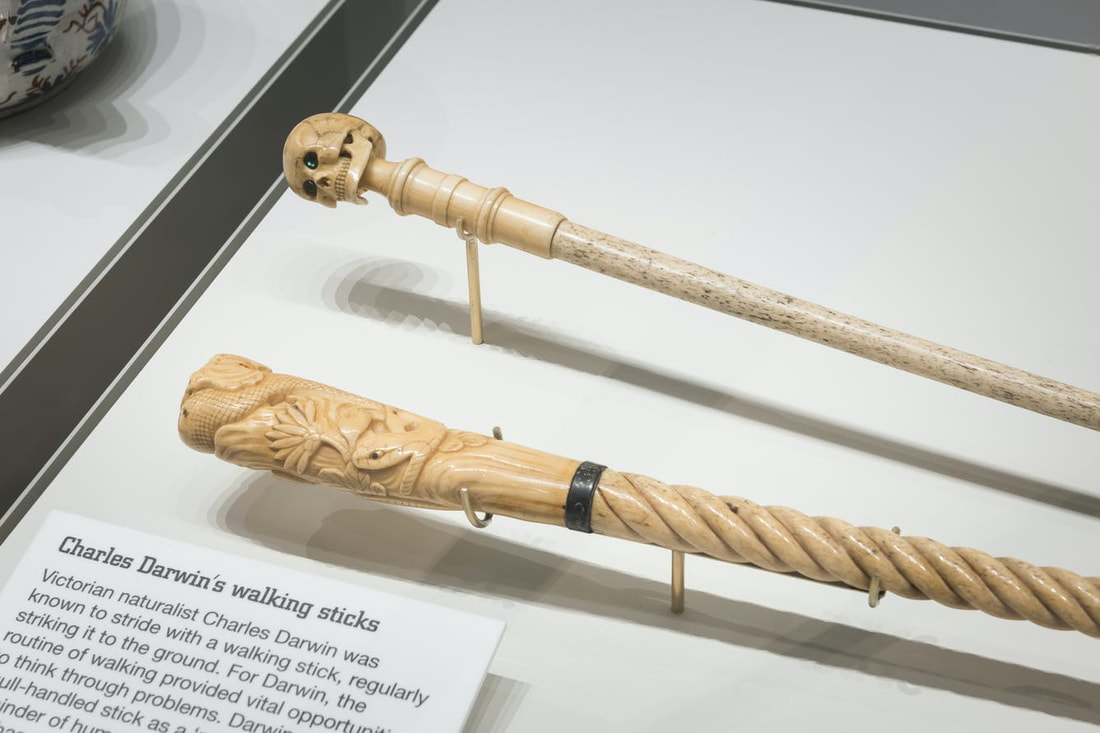
The artistic display of Charles Darwin's walking sticks, displayed in the 'Medicine Man' exhibition, is a form of art that is effective at expressing the formal element of line. The walking sticks displayed explore the element of line, from the body and stem of the sticks, to the head of them. With the stick closer to the foreground, the walking stick explores line through the carvings of line in order to create a pattern. The head of this walking stick emphasises this further through the intricate pattern work. The background walking stick similarly expresses the formal element of line, until it reaches the head of it. The skull present on the stick conveys the formal element through the use of tiny lines, which can express the bones of skull, and most predominantly, the jaws.
|
Formal Element: Tone
|
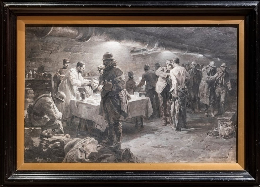
This illustration by Ugo Matania depicts a group of numerous soldiers being medically treated for wounds in the safety of an underground bunker. The illustration presents the soldiers in a monochrome state, which allows there to be a variety of shadows and highlights to be created and established. This therefore allows a variety of tone to be explored and emphasised, from very highlighted tones to dark, almost jet-black tones. When photographing this illustration, I would like to enhance these tones in my work, as the extensive use of tones expresses the three-dimensional illusion within the artwork.
|
Formal Element: Texture
|
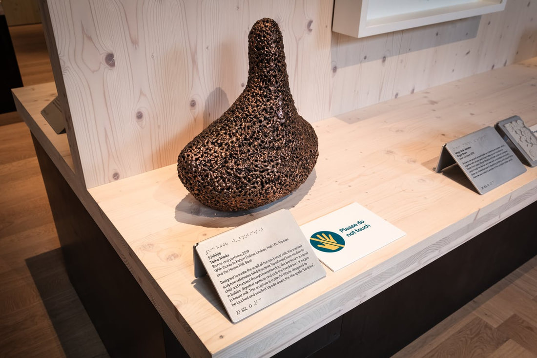
This sculpture titled '5218008' is displayed in the 'Being Human' exhibition. Through the various layering and spacing of the copper used to construct this sculpture, the element of texture is emphasised. by photographing this element in my won work, I will be able to explore this formal element even further, and begin to portray the tactile qualities of the objects I photograph myself. More specifically, with this sculpture, the organic nature of it is expressed, as the context relates to organic organisms since this sculpture was designed to represent the nature between the bacteria present in the immune system of babies, and breast feeding.
|
Formal Element: Shape
|
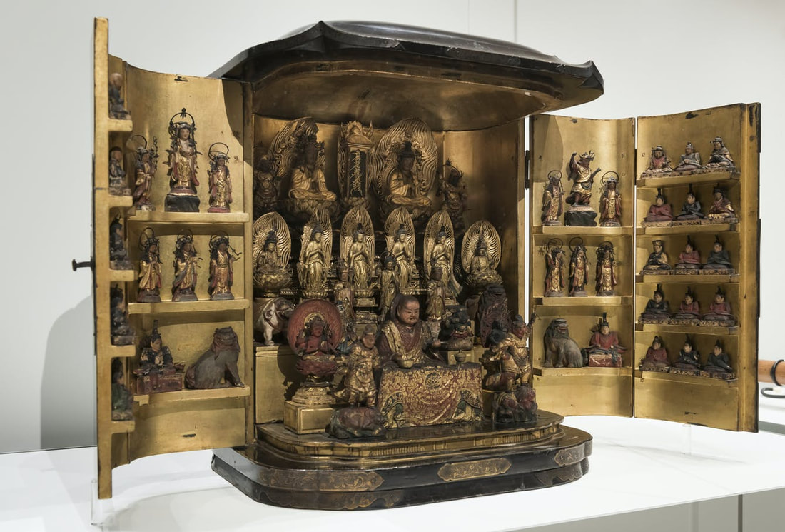
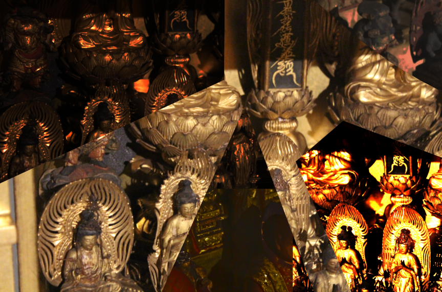
This form art present in the 'Medicine Man' exhibition depicts a shrine of religious artefacts from Shintoism and Buddhism, which were commonly used to ask for divine help, more specifically in a healing aspect. The artefact, and the shrine itself expresses the formal element of Shape as many shapes, ranging from being large to very tiny and intricate, have been used to create the religious display. With my own photography work, I would like to focus on the intricate details present in the statues, and photograph them from a shallow depth of field to expresses the variety of shapes that have been utilised, By doing this, not only will I express there formal element of shape, but also possibly link my own work to the context of the shrine, and further my development in the course by experimenting in different fields.
|
Formal Element: Space
|
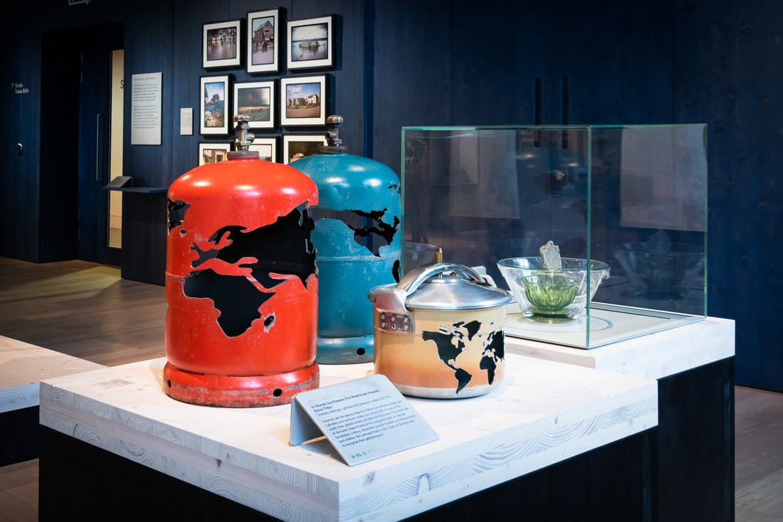
This artistic display created by Batoul S'Himi which is titled 'The World Under Pressure' is displayed in the 'Being Human' exhibition. The carving of the global map into the pressurised gas canisters expresses the idea of negative and positive space in these objects, as well as producing an intangible aspect of space within the canisters themselves. By focusing my camera to each individual canister, I can explore and emphasise the formal element of space. Through experimenting with different angles and lighting, the element of space will be emphasised in more specific ways.
|
Formal Element: Pattern
|
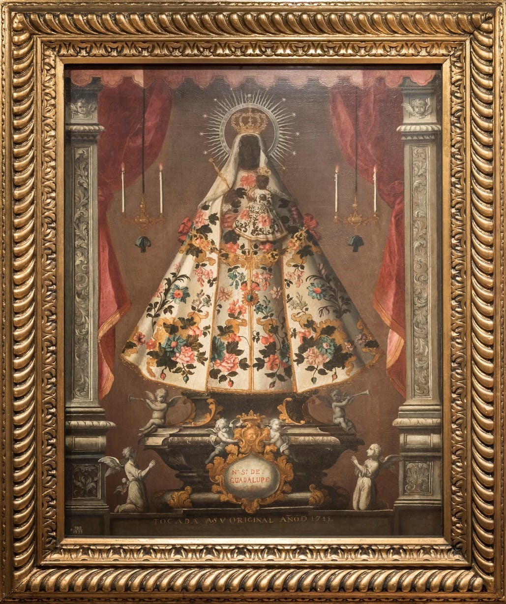
This painting displayed in the 'Medicine Man' exhibition is a depiction of a statue called 'Black Madonna', which is found in Extremadura, Western Spain. The framework of this painting, both the outer and inner layer, emphasise a beautiful and intricate pattern. Through further observation, the formal element of pattern is expressed by almost every aspect from the painting itself, ranging from the carvings of the pillars to the dress of the Virgin of Guadalupe. When photographing, I can initially focus on the framing of the painting to portray the idea of pattern. After this, I can draw my attention to the internal objects of the painting, specifically to the carvings of the pillar.
|
Formal Element: Form
|
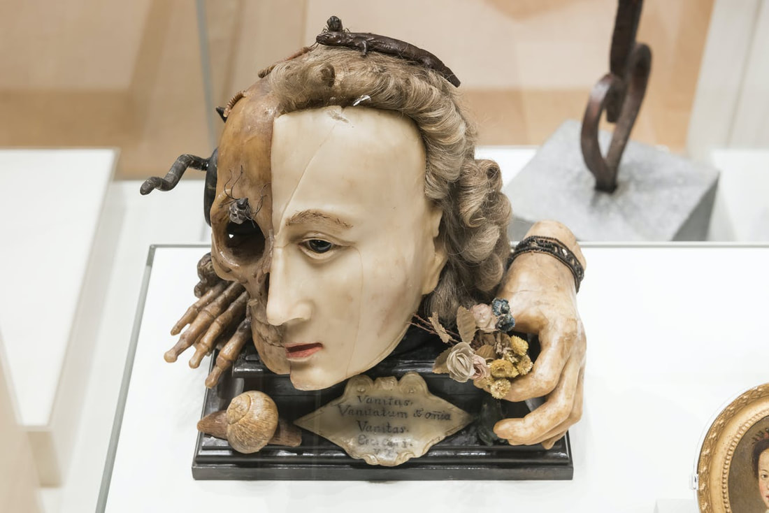
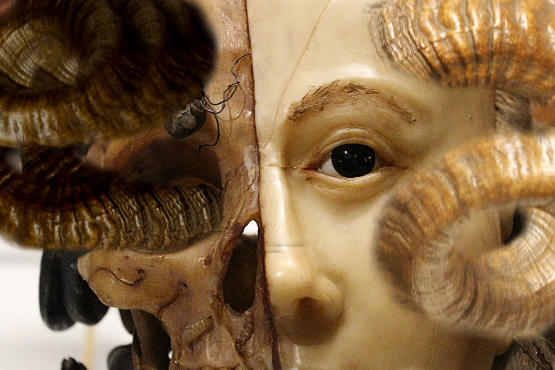
This cloth and wax work modelling Queen Elizabeth I, displayed in the 'Medicine Man' exhibition, explores the formal element of form by incorporating height, width and lots of depth. By having a division in the middle of the face, there is an overall contrast of the image. yet the proportions of the model still convey the elements of height, width and depth- targeting the formal element of Form overall. To express the formal element in my raw photography, I will draw my focus to the model as a whole, rather than focusing too much on specific areas. By creating shallow depths of fields, i will be able to draw this focus to the model, whilst the background would be blurred.
|
Raw Photography:
Formal Element Edits
Texture/ Pattern:

|
My first edit, which conveys the formal elements of Texture and Pattern, was created on an editing software called Pixlr. It consists of three raw photographs taken on my visit to 'The Wellcome Collection', which expresses how personal this work is to me. On Pixlr, the first stage of my edit was choosing these three images, and I made this decision as they all presented the formal elements of texture and pattern, as well as being complementary to each other, which helped boost the edit. From here, I had set a background layer which acted as the foundations to the whole edit, and began opening my images. The main photograph in focus, this being the central image in the edit, was opened first as I wanted to position this in a way which would allow the other images to blend through. I then began opening the other two images, layering them underneath the first image, and positioning them in opposite sides to each other. By using the eraser tool, I began to create circular marks on the main layer, which created patterns in the edit. The eraser tool allowed the images underneath to now become visible, and the specific positioning allowed the lines present in this photograph to create visual, leading lines throughout the whole edit, which hopefully engage the reader by causing their eyes to move fluidly through the edit.
|
Form:
|
This edit, which covers the formal element of Form, was also created on the Pixlr editing software. Similarly to the prior edit, the first step was to choose images which both expressed the element of form, but also would work harmoniously together. For this edit, I chose my photograph of the cloth and wax work, and my photograph of a goat's head. I opened up the cloth and wax work, which consisted of a face split in half, one half being skeletal and the other being normal. This image acted as my base, and I then opened the photograph of the goat head. At first I was challenged as I did not have an idea on where to begin, but then I made the decision of removing the horns from the goat, and adding them onto the wax head. On the side with the skin, I adjusted the hue and saturation to a specific level in order to match the skin tone, and make it look as if the horn was naturally there, and touched this up with subtle use of the eraser tool. On the other side of the head, I duplicated the coiling horns three times and layered them on top of each other, and positioned them to exit the eye socket, acting as a snake. As this side of the face was slightly darker and contrasted the other side, I adjusted the hue and saturation to a level which resulted in these horns being much darker and this created a contrast. This movement of the coiling horns, and the overall contrast in the image expressed depth very effectively, which overall helped to convey the formal element of form.
|
Colour:
|
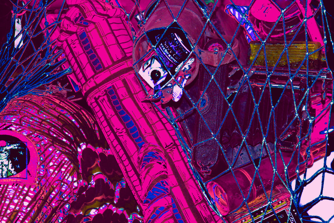
This edit, which covers the formal element of Colour, was another edit which was created on Pixlr. This edit is a slightly more experimental approach to portray the formal element, as I wanted to experiment with varying the intensity of colours on a raw photograph from the gallery visit. As I was tasked with portraying the element of colour, I did not choose to do any layering in this edit, as I thought it would draw focus away from the formal element itself. Instead, the process of creating this edit involved opening one of my raw photographs from the gallery which originally consisted of many colours, and then emphasising these colours. This meant that rather than experimenting with the different tools which I had done with my previous edits, I instead experimented with the adjustments of this image. When the photograph was opened, I opened the ‘Adjust and Filter’ tab, which greeted me with many different elements to alter. I began by adjusting the elements which immediately changed the colour, this being the vibrance, hue and saturation. By experimenting with these settings, I was able to create an interesting colour pallet in my work, with colours which were different from each other, yet complemented each other and worked harmoniously together. The vibrant, neon pink was very outgoing and bold, portraying how experimental this was, whilst the navy blue acted as an anchor to the image, allowing the eyes to rest when viewing the image. When the colours were adjusted to my desire, the next step was to alter the light levels in the edit. This involved adjusting the elements of brightness, exposure and contrast, as well as shadows and highlights. As the edit already consisted of an incredibly vibrant pink, I wanted to lower the light levels to create a contrast and prevent the edit from becoming overexposed. By decreasing the brightness and exposure, yet increasing the contrast, an overall contrast between the colours in the image was created. The final touches included adding highlights which were presented as white lines in the foreground, as well as adding shadows to support the overall contrast. To ensure I was satisfied, I compared my edit to the original photograph, and after sharpening the image and adding slightly more clarity, I was happy with my edit. Although it’s very experimental with the bold use of colours, I believe it has worked well as it expresses the formal element of colour in a unique approach, which further supports the experimental nature which is required from edits.
|
Line:
|
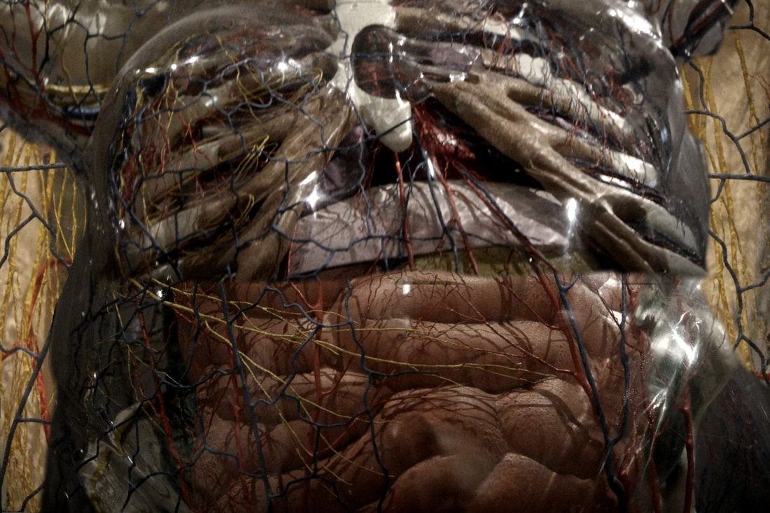
This edit, targeting the formal elements of line, was once again created on Pixlr. When creating my edit, I was faced with the difficulty of choosing which raw photographs to use, as almost all my raw photography from the gallery visit contained line, which meant that I had lots to choose from. However, rather than expressing line in a basic way, I wanted to express it in a sense of movement and fluidity, as well as linking it to the human body, which ties incredibly well with my gallery visit, and therefore I chose to use my raw photography on the transparent body figure which presented veins, arteries and capillaries. Once I chose the three images I wanted to use, I opened the first image to act as the front layer. This main layer consisted of many different veins and arteries, branching in multiple directions, which presented the sense of movement I originally desired. From here, I opened another photograph and reduced the size to allow it to fit on the sides of the edit. I duplicated this layer and flipped it vertically, which allowed me to mirror the exact same lines on opposite side of the edit. I positioned the duplicated layers beneath the main layer and utilised the eraser tool on the front layer to allow the those beneath to now be visible on the sides. I lowered the size of the eraser brush, and carefully removed the edges between the different layers to blend them together, creating an illusion. I then opened the last image, which focused on the arteries and veins within the chest area, which meant that, with careful observation, I could place this image on the main layer and make it look as if the two layers were one image, as the main layer focused on the intestines. When positioning the final image in front of the other layers, I subtly reduced its size to enable a perfect fitting onto the whole edit. I then utilised the eraser tool to not only remove the edges between images, but also to carefully remove some of the veins form the final layer, which allowed them to perfectly join to the veins from the layer beneath, creating this sense of perfection and rhythm. Finally, I added the same filter with 60% opacity to all layers, which allowed the lines present in the edit to become more bold, ultimately presenting the formal element of line.
|
Space:

|
This edit, covering the formal element of Space, is slightly different to my other edits as it was created on Photoshop. With this edit, I initially struggled with an idea, as it was difficult to present Space in my edits. After further research, I discovered the elements of negative and positive spaces, which then motivated me to try emphasising these different types of space in my own work. For this edit, I used two of my raw photographs which depicted gas cylinders with the world carved into them, with the continents emphasising space in the cylinders. I opened my first raw photograph, a blue cylinder, and this acted as the base layer as it already contained lots of carvings expressing the space in the image. From here, I opened the second photograph which was a more zoomed in photograph containing lots of separate carvings. As these carvings were not connected, I found myself with the idea to add these carvings to my base layer. To do this, I duplicated the background layer of the second photograph, and began using the lasso tool to capture the carvings which I wanted to add. Once selected, I used the select tool to grab the selected area and move it to my baseline layer. As the cylinders of the two photographs were different colours, I used the magic wand tool to select the coloured parts of the new layer I had added, and removed them, which removed any background of the new layer, making it look like the carving belonged on this image. I carefully positioned it in a natural position which looked realistic and duplicated it to create more spaces in the image. As I didn’t want to go over the top with the same carving, I returned to the second photograph to choose a new area to add. Once again, I used the lasso tool to select this area, and move it to my base layer. This time, the layer was far too large, which meant I had to reduce the size, in pixels. Once this was done, I used the magic wand tool and the same procedure followed. I continued to do this until I added all the possible carvings, ranging from different sizes. I also opened my other raw photographs of the gas cylinders form the exhibition, but unfortunately, the other photographs did not contain any effective spaces which I could add onto my edit. Once I went through all the raw photographs and realised, I could not add any more spaces, I added subtle adjustments to the layers I added to add higher contrast and make the spaces more noticeable in order to express the formal element. I am happy with this edit as I believe I have been able to portray the formal element in a unique and well-thought way, as well as showing a sense of experimenting with the different tools on Photoshop.
|
Tone:
|
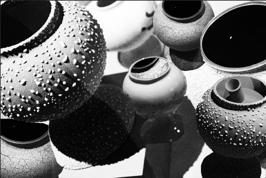
This photoshop edit targets the formal element of Tone. With most, if not all, of my raw photography from the Wellcome Collection, a simple black and white alteration would be able to portray tone. However, with my edit, I did not want to do that in a basic way, but instead approach it slightly more experimentally, by using lots of layering and other of the Photoshop tools. I found that utilising my photography on small vases from the exhibition was the most effective for this edit, as they consisted of many tones as well as an effective contrast between the tones. Like all my other edits, I had to choose a raw photograph which would act as the base of the whole edit. The photograph I chose consisted of two vases, and from here, I opened two other images of separate vases, which I layered onto this base layer. Instead of overcrowding this layer, I positioned the two new vases onto the mouth of the original vases, made the new layers smaller, and edited them into the mouths of the original vases using the eraser tool. From here, I merged all the layers into one, and moved this layer onto a brand-new layer which now consisted of three vases; this new layer now acted as the base. I separated the vases in the merged layer by duplicating it, and deleting one vase from each layer, which allowed me to separately move the two vases which were originally joined in one layer. From here, I positioned these new layers beneath the main one, once again utilising the eraser tool to allow them to be visible in certain sections. This process continued for one extra vase, which I duplicated to add one final vase to the edit. From here, I constantly adjusted each layer through the ‘Adjustments’ tab, which allowed me to alter the brightness and contrast until I was satisfied with the tones present in my edit. By layering the different types of vases and tweaking the contrast, brightness and exposure, I was able to produce an experimental edit which conveyed the formal element it was initially intended to target.
|
Shape:
|
This edit, targeting the formal element of shape, was created on Photoshop. For me, producing an edit for this formal element was the most difficult, as I was faced with many difficulties when trying to compose creative ideas. Fortunately, after analysing the raw photographs I had for this formal element, I decided that I would utilise the shape tools on Photoshop, and place images in different shapes. The first step for this edit was choosing the foundation of this edit, which again was one of my raw photographs, one depicting a Buddhism religious shrine. When I set this as the background, I duplicated it to allow myself to properly edit it. I first began by utilising the ‘Polygonal Lasso Tool’, which allowed me to create my own shapes in areas I chose. Once the lasso tool sectioned a specific area, I deleted it to allow a cut-out in the base layer of the edit. From here, I opened another raw photograph, reduced the size, and moved it onto the base layer, positioning it just above where the cut-out area was. I moved this brand-new layer beneath the main layer, allowing it to perfectly slot into the cut-out. I continued this process, experimenting with shapes ranging from triangles to different types of quadrilaterals, and utilising the various raw photographs I had taken. After adding four cut-outs, I decided to stop as I did not want to overcrowd the edit, as that would make it look accidental rather than calculated. I then wanted to add a contrast between all the different layers to highlight the use of different shapes, linking back to the formal element. To add these contrasts, I referred to the ‘Adjustments’ tab, which allowed me to alter the levels of light in all the layers by adjusting elements such as brightness, contrast and exposure. For each layer, I adjusted these settings to varying values to create an overall contrast between the layers, and the edit itself. Although I struggled with this edit at first, I am happy with how it has turned out as it expresses the formal element in a unique, and experimental way.
|
