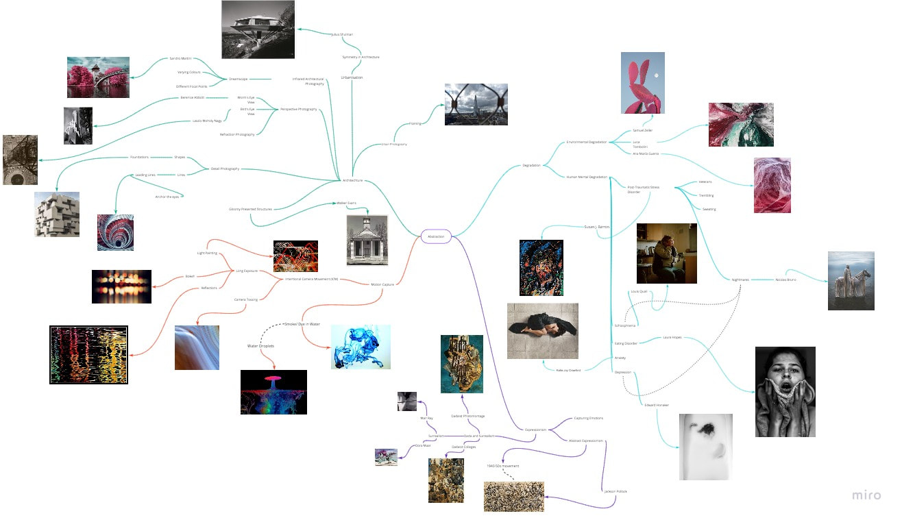
My Exploration in Abstraction:
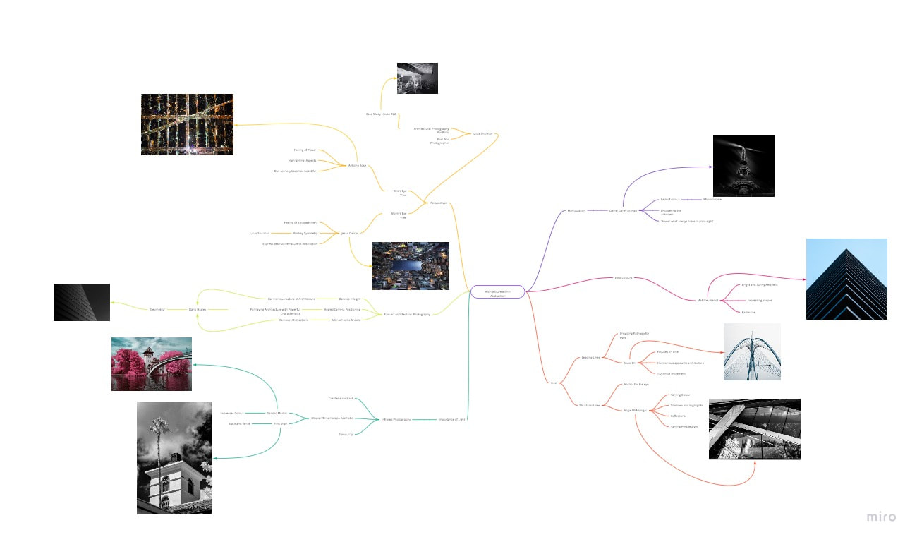
First Artist- Julius Shulman

This photograph by Julius Shulman, created in 1960, is titled ‘Case Study House #22 (Two Girls) and falls into the genre of architectural photography. Shulman was an architectural photographer part of the post-war generation, and his photographs predominantly focus on providing expression which architects were not able to do, as the basic architect ‘doesn’t know how to create a design of his image’ (https://www.azquotes.com/author/44482-Julius_Shulman). This photograph depicts Case Study House 22, which is one of the most well-known pieces of architecture in America. Within the building, there are lots of different items of furniture and décor presented in a stylized manner, which is effective as it portrays the importance and class of the building designed by Pierre Koenig. Additionally, the photograph depicts two woman who seem to be posing and conversating in an elegant and fashioned manner. Through this specific posing and presentation, it can be argued that Shulman has chosen to include these women in his photograph to emphasise the luxurious and modern design of the building, once again linking to the idea of Shulman providing more expression and character to architecture, much more than the actual architect could even do him/herself. Another important aspect of the photograph is the architectural elements which have intentionally been included in the shoots. By providing these elements, Shulman can portray that the elements work harmoniously to form the architectural structure of any buildings he focuses on. He also creates a subtle juxtaposition within the photograph when choosing to include potted plants in the shoot, as these are the gateways for nature to be expressed within the image. By doing this, Shulman creates the juxtaposition of two elements which commonly contradict each other in the modern world, since architecture is slowly damaging and removing aspects of nature. The careful consideration of these elements, as well as Shulman’s photography technique, allows this specific photograph to illustrate a moment in history: when the Case Study House 22 was complete and publicized. This is a significant moment in history as the Case Study House was used in many famous Hollywood films after it was recognised through Shulman’s work. The modern architecture constructed on the hills of Hollywood is found overlooking Los Angeles, with the illusion that the building is hanging off the hills. This specific illusion fools the viewer and makes it look as if it is a freeze-frame of the building falling and moving, allowing the slight exploration of movement. This illusion of the building almost floating above LA helps depict the contrast between architecture and nature, and subtly emphasise how architecture is beginning to dominate and empower. The complex architecture portrayed in the photograph depicts abstract elements of lines and bars. These express the foundations of the building, and allow viewers to recognise the fundamentals and basic which will ultimately construct the complex structures of residential architecture. Whilst Shulman did not need the approval of other artists or photographers, he needed the approval of Pierre Koenig, as he was the architect who designed this building, and allowed Shulman to produce photos of his newly constructed building. This appreciation was important for Shulman, as it was similar to the opportunity he was given by Richard Neutra, the architect that gave young Shulman his first assignments. When first perceiving this photograph, the feelings of dangerous and slightly unnatural positioning were expressed to me. This not only helps to portray the power and capability of architecture, but also to emphasise the growing power of humanity, which is almost posing a threat to nature. These instigated feelings allow Shulman’s photograph to have a direct and confronting tone, which links to Shulman’s confident personality. This then results in feelings of excitement and interest being instigated from myself, as I enjoy how Shulman is able to create the dominating nature of architecture, which is something I’m very passionate in. This photograph also directly links into my thematic work of abstraction within architecture, which I have began recently. From the way Shulman works and expresses his feelings and observations, I am able to learn how to add these into my own photography in the near future. By incorporating Shulman's techniques into my own work, I desire to focus heavily on architecture and the formal elements within them, and present them in specific ways to allow my viewers open to interpretation, rather than producing something easily noticeable. I will aim to do this by isolating certain elements, or experimenting with light and perspective, which will allow for my photographs to become slightly 'out of reality'.
This photograph by Shulman was created in 1960, in the Hollywood Hills of Los Angeles, with the intention of expressing the complex design of this architecture. This allowed for Shulman to focus in publicizing and promoting the Case Study House 22 to public viewing, and allow it to gain more recognition, arguably leading to its involvement in many films which had occurred after Shulman’s work. The construction of this architecture being in LA reflects the value of it, as many expensive and well-known residential properties are found in the ‘City of Angels’. Through the worldwide reproduction of Shulman’s work, the property was able to gain international recognition and also allow Shulman to continue building a collection and portfolio of architectural photography. At the time of this photograph, there were many movements happening in America, an important one being the environmental movement. This was significant for Shulman’s work, as his work would contradict the feelings around the environment. By producing his architectural photography during the environmental movement, Shulman presented himself as a very bold and confident photographer, which could possibly be one of the reasons that Case Study House #22 (Two Women) was one of Shulmans most known works. Due to my passion in architecture and property, my interpretation is slightly distorted into becoming more biased. This results in me becoming much more interested in the photograph and begin to analyse the small, fundamental details which compose and construct the property, whilst the public may just admire the scenery and overall aesthetic. The environmental movement context behind this photograph slightly links to the context around my work. In today’s world, as well as the global pandemic still being present, there are many different environmental movements which are common, which contradict my focus in architecture, and possibly will help me to work in the style of Shulman and present myself as a bold and confident photographer.
The dimensions of this photograph are 20 by 24 inches, in a vertical, rectangular shape. It has been printed on gelatin silver print, along with many of Shulman’s works. This results in the image being suspended in a gelatin emulsion, allowing the image to be very defined and highly detailed. Through the use of gelatin silver print, over platinum or palladium prints, Shulman’s work was becoming more developing, as well as the whole field of photography, which was a growing form of art at the time. When being reproduced, the photograph would be able to perfectly fit into a frame, which is effective as it enhances the structure of the property, which is calculated and perfect to allow a successful and complete construction. As the photograph focuses on the building designed by Koenig, it immediately seems site-specific to only portray this building. However due to Shulman’s intention of providing the building with recognition, it is undoubtably possible that his photograph was designed to be displayed across multiple locations to inform many different societies of the architecture. The format and dimensions are important for this photograph, as they help mimic the building from the rest of the LA city. The specific dimensions allow the photograph to emphasise how calculated and specific the dimensions of the architecture would have been; whilst the format expresses the structural elements of the building, conveying the shapes used and as a result, convey the dominance of this building. When experimenting with architectural photography, I believe it would be important and beneficial for me to adopt this technique, as it will allow me to constantly link every aspect of my photographs to my specific idea, as well as exploring the individual structural elements which compose architecture to subtly explore abstraction.
When observing this photograph, it is clear to notice that Shulman has used multiple different composition rules to develop his photograph, rather than using a random and chaotic structure. It could be argued that Rule of Thirds can be seen in this photograph, as Shulman has divided his photograph into three imaginary sections, to allow the support beams of the building to act as some of the focal points, with the others being the lit city roads. It is also clear that Leading Lines have been used, as there are many lines present in various areas of the image, which lead the eye on a journey throughout this image, starting from the foreground and moving through the building, until reaching the stretching city of LA. Considering this structure in the photograph was effective by Shulman, as it mirrors how organised and premediated the architecture of this building actually is, once again linking to the idea that architecture is very complex. Within the building itself, there is also a visible alignment of the furniture, and the conversating. Although this is subtle, it is very effective as it helps create the harmony within the building, subtly conveying how ‘perfect’ the building, and possibly helping to increase the emotional value of the building. On the exterior however, it is clear to see that there aren’t symmetrical aspects in the rest of the photograph. Although the building potentially is symmetrical in the foundations, in this image it has been photographed slightly off-centre. This is very effective as it allows the empowering nature of the building to be expresses, as well as solidifying the illusion that the building is floating, which was mentioned earlier. Another interesting factor is that although there isn’t much symmetry, the eye of the viewer can still find balance when perceiving the part of the building which seems to be floating and stretching away, which is a very strange but effective technique from Shulman, one which really allows the image to be very intriguing. As I progress throughout my journey in architectural photography, I believe it is crucial for me to mirror these techniques in my work, as it will allow me to produce aesthetically informed photographs which portray not just the building itself, but the processes and emotions which also go into the construction of the building.
Within this photograph, there are many lines present and each of them are slightly different in what they influence. The most dominant lines are seen in the actual building itself, both interior and exterior. These lines help the viewer recognise the foundations of the architecture, as well as acting as guidelines when observing the different aspects of the building. The slightly less dominant, but still crucial lines are seen in the city in the background of the image. These lines also act as leading lines and allow the viewer to move throughout the city roads, as the lines stretch until they are no longer visible in focus. These lines are all visible but help to create implied lines which the viewer creates themselves, and this is most commonly the case when observing the city which seems to stretch away. I believe that including a variety of lines in my photography just as Shulman did will be effective as they will allow the viewer to have different focal points and move to each focal point very easily whilst also viewing my photographs as I would like them to be viewed as, for example from certain perspectives or from one area to another.
Through the harmonious nature of the shapes included in the image, the Case Study House #22 to obtain a geometric and complex visual image, as well as the obvious architectural element. With the building itself, the edges of forms are very distinct and hard-edged to emphasise the manufacturing and construction behind the publicising of this building. This is then contrasted when focusing on the city, as the edges are much less defined and almost blend and fade into the deep background, which eventually reaches a point of being unfocused. This contrast is important as it allows the viewer to recognise that the building is the focus of the image, and Shulman can reiterate this message through various techniques. The supporting beams seen on the interior as well as the exterior of the building allow the sculptural elements to enhance the three-dimensional form of the building, which overall can help solidify the illusion that the building is floating. The structure of the building also repeats many of the same shapes, the most dominant behind rectangular and square shapes. These help to emphasise the fundamentals of architecture, whilst also allowing to create the harmonious nature of the building, which is even more effective as it ‘floats’ over an elegant and lively city, almost creating an irony out of the name ‘City of Angels’. The repeated shapes are continued in the city yet are relaxed and aren’t as defined as those within the building’s structure. This allows the city to be seem as almost dreamlike and draws focus back to the Case Study House. I once again believe that using shapes like this in my own work would be extremely beneficial, as it will allow me to create harmony within my photographs and allow dramatic effects to be created.
As this photograph was produced in a gelatin silver print, Shulman’s work is in monochrome. This allows a variety of tones to be expressed in the photograph, ranging from broad dark tones within the city, to highlights and mid-tones within the architecture itself. Through the mid-tones, it is clear to recognise that the most significant light sources are coming from the hanging ceiling lights, as well as possibly some out-of-frame light sources coming from further within in the building. This, as well as the very subtle lights from the city, allow the photograph to mimic the time of day and the different lightning conditions which would be achieved in this time. The variety of tones which gradually blend on the structure of the building allow the three-dimensionality to be expressed, whilst also contrasting the flat elements which can also be seen. The dark, dominating tones expressed from the city allow an atmospheric perspective to be conveyed, as the tones become paler as the city stretches away. The shadows emphasised below the building are also effective, as they create the illusion of depth, as well as supporting the previously mentioned illusion of the building almost floating above the ground. The contrast in tones within this photograph allows the viewers eyes to constantly draw focus back to the building, which once again is the important subject of the photograph. Using tones similarly would be beneficial for my own photography work, as it would allow to produce three-dimensional photos with depth, occasionally creating illusions, and constantly reminding the viewer what my main focus is.
Another element that the production in gelatin silver print affects is the colours available in the actual production. As the photograph was produced in a suspended gelatin emulsion, the photograph can only be viewed in monochrome, and in quite a low quality. Although this expresses that photography was still growing, Shulman was still able to avoid these constraints and produce an aesthetically infromed photograph which had significant intentions. As the colour in the photograph is quite limited, it can be quite easy for viewers to interpret it in a dull perspective. However, as the colours are all complementary, they all work harmoniously together to create a balance within the image. The slight contrast between the black and white depicted allows for this harmony to continue being expressed in the image, as well as emphasising thematic connections. As these colours are only available for Shulman’s work, he was able to portray the struggles he had to face with the limited photograph he had to result to, meaning he could not work with colour, making it slightly harder to add expression and design to the architectural photography. Nonetheless, Shulman was still able to use the limited colour pallet to produce this engaging photography, which clearly allowed him to follow his intentions. I believe with my photography, using a more intense colour pallet would be more beneficial, which can lead me into the field of linking infrared photography and architectural photography together.
Through the help of lines and tones, Shulman can express the tactile qualities of his surroundings in his work. Within the interior of the building, smooth and polished surfaces are portrayed to emphasise the luxurious lifestyle. As focus moves to the exterior of the house, rough and rigid textures are expressed through the foundations and support of the building, which connotes the labour and hard work that would have been put into the construction of Koenig’s work. As focus is then drawn to the city in the background, textures become much less visible due to the city being too far away. However, through the repeating lines and patterns emitted from the city, the viewers are able to imply structures that those buildings would have, should Shulman focus on them in his work. These repeated elements within the city allow for the photograph to have rhythm, as well as depicting how busy the city usually is. This rhythm is then broken when Shulman redirects the focus to the building, as there aren’t aspects of rhythm. Instead, this contrast in textures allows for Shulman to constantly direct the focus back to Koenig’s work, which of course was the main intention. I believe using texture in a similar way in my own work would be beneficial, as textures within architecture are very important, and being able to express texture and tactile qualities within architectural photography is a very important skill.
The pictorial space of this photograph is quite deep, and one of the main factors for this is within the background. By expressing the tones within the city becoming paler the further away they are, Shulman is able to portray the city with the illusion that it is stretching away, emphasising how big the city actually is. This illusion allows the photograph to have a lot more depth, as well as signifying how important Koenig’s building is as it looks over the vast city. Shulman also explores depth through the shadow underneath the building. This shadow acts as an anchor to the eyes, but also supports the illusion of the building ‘floating’ above the ground. Another important factor in the pictorial space is Shulman’s viewpoint when photographing the building. Rather than having a straight-on viewpoint, he has decided to use a slightly off-centre viewpoint. This is incredibly effective as it allows him to capture both the residential property, as well as the city behind it, allowing for Shulman to produce a photograph which publicises the architecture a lot, allowing for Koenig to gain more recognition also. This specific viewpoint also allows the building to engage with the real space, showing its relationship with LA. Using space similarly would be very beneficial for me as it would allow me to include depth in my photography, as well as expressing the surroundings of architecture, which is incredibly important in architectural photography.
Although it is unclear for this photograph due to the lack of clarity, Shulman mainly used a Kodak Vest Pocket camera when working in architectural photography. He received it on his 23rd birthday and was a common favourite of World War 1 soldiers. As Shulman was a post-war photographer, using this camera made his work very personal to him. The old-fashioned style of the camera expresses how photography was still a growing art form, as well as conveying how skilled Shulman was at architectural photography, linking to his statement: ‘I know for a fact that I am good’ (https://www.azquotes.com/author/44482-Julius_Shulman). The use of this camera also helps to convey how far photography has developed, as well as allowing Shulman to make a name for himself, quite early on in his career. This will slightly differ in my work as technology has clearly developed, and photography has also become a widely recognised form of art.
In my next steps, I hope to use all this research and analysis on Julius Shulman to produce a wide range of architectural photography, which are influenced by Shulman’s work but also rely on my own unique creativity and thinking. I also hope to create edits which explore the theme of abstraction through using architectural photography. In the near future I also hope to experiment with infrared photography, both coloured and monochrome, to add a new visual to my work.
Raw Photos, Architectural Photography


This photoshoot that I have presented here is my practical response to the work of Julius Shulman. After studying Julius Shulman and analysing his most famous work, Case Study House #22, I was able to understand his unique techniques and ideas that are put into his work. With my practical response, I wanted to take the idea of expressing the fundamentals of architecture, which I was inspired to do so by Shulman, and to express them in my own, unique way. To do this, I first wanted to take shots of buildings through windows. This would allow me to express the basic structure and aspects of buildings by capturing them from a far vantage point, like Shulman. By including the slight reflection from the window, I was also able to slightly connote the idea of abstraction within my work, allowing the link to my overall thematic study. I also chose to vary the f/stop of my photos, to allow some of the shoots to contain aspects of nature, allowing myself to tie into different themes and developing my work overall. However, after reflecting on these photographs, I believed I could push my idea of abstraction within architecture through a much more unique way. By careful consideration, I decided to construct a small building from pieces of Lego, as these basic shapes allowed me to express the fundamentals of architecture. I used the same colour for the exterior, as I did not want the small building to become too chaotic but instead be subtle. With my construction, I also chose to design it in a way to mimic the buildings that are very popular in America, and those that Shulman focused on in his work. When photo shooting this, I wanted to first include the aspects of the window once again to express architecture as I did earlier. However, I wanted to make my photoshoots much more aesthetically informed to allow abstraction to constantly be expressed. In the dark photography studio, I set up my own photoshoot, and used a white background against a white base. I then tied lengths of fishing wire and tied the longer length of the wire behind the white background. This allowed me to suspend the Lego building in the air at an angle, and I was able to vary the height by either pulling or releasing the fishing wire. I made sure to suspend the Lego creation at reasonable heights, as this allowed me to gain the most realistic appeal, without making the photoshoot appeal as uncalculated or unintentional. I utilised the various lamps available and set them at certain heights to create the needed shadows that can be seen in my work. As the Lego creation was elevated, it would occasionally spin due to the tension in the wire, which meant that I was able to capture it from various angles. By also photographing quite close to the subject, I was able to experiment with the values of size, therefore presenting the Lego creation as quite large and empowering, whilst it was much smaller and fragile. This allowed my work to explore different elements of abstraction, as well as mimicking the idea of Shulman adding expression and character to any photography work. By also utilising shadows to my advantage, I was able to create the illusion of capturing the Lego creation mid-fall, which is like the illusion that Shulman had created in his work of Case Study House #22. I believe using these techniques and elements that I have mentioned has allowed me to create an aesthetically informed photoshoot which portray that I have been able to take an idea from Julius Shulman and incorporate into my own work to explore abstraction within architectural photography. To push this idea further, I hope to revisit this photoshoot and create more Lego creations with more attention on the interior as well, as this would allow me to link my work even further to the techniques I have adapted from Julius Shulman.
Edits on Architectural Photography

Original Photograph
|

Photoshop Edit
|

Original Photograph

Original Photograph
|

Photoshop Edit

Photoshop Edit
|
The images presented above represent my photoshop edit in response to working within the theme of ‘Abstraction within Architectural Photography’. As captioned, the two images presented are different, one being the original photograph which composed the edit, and the other being the edit itself. With my edits, I wanted to highlight the fundamentals of architecture in unique ways within each edit. In this specific edit, I wanted to utilise shadows to my full advantage, to fulfil that overall intention. To prevent myself from becoming distracted and less clear with my intention, I made sure to make subtle, yet effective, changes to this photograph. The first stage was cropping the image itself. After opening it on photoshop, I had noticed that the off-centre angle of my raw shoot had included areas which drew focus away from the main subject. I made sure to utilise the cropping tool to instantly remove this area, and shift the overall focus to the Lego construction, which was the key to emphasising the fundamentals of architecture within the raw shoots, as well as the edits. Once I was satisfied with the cropping, I then decided to apply an adjustment to the image, which was to change it to black and white. This stage is not clear in the final product, yet this monochromatic stage was key to my edit. At first, I decided to apply this change as I wanted to link my edit to the work of Julius Shulman, who has been a key photographer for me since working in this theme. However, I then decided to not directly link my work to Shulman, and I instead experimented with blending options. As now, the background was full of colour, and the top layer was monochrome, the blending options allowed the two layers to blend in intriguing and aesthetically informing ways. The monochromatic appearance of the top layer allowed the blending option to apply more emphasis onto the shadows present in the background, which was incredibly effective in reflecting the fundamentals of the architecture. I then opened the shadows and highlights adjudgments tab to finalise the edit by increasing the tone and radius of the shadows on Lego construction itself. Not only did this darken the overall colour of the creation, but also provide crucial shadows to certain areas to the creation, to make the edit look much more realistic and convincing, as well as allowing the basic structures to be portrayed, linking back to my original intention.
I then moved onto my second edit, which shared the same intention in a slightly different approach, which was slightly more abstract. To also link my edits to exploring abstraction within Architectural Photography, I wanted to utilise my raw shoot of the suspended Lego construction and present it in a way which connotes and supports the idea of abstraction. As can be seen, to do this, I duplicated the Lego and edited the two together, almost reflecting the Lego creation. To do this, I utilised the quick selection tool, after opening the images, which allowed me to separate the creation from the background, and realistically join it to the other Lego creation. To make the edit look even more realistic, I used the selection tool to duplicate the shadows also, placing it carefully below the construction in the area I believe would contain the most emphasised volume of shadows. I noticed that the new shadow layer still contained sections of the background, which made the shadow look too unrealistic and almost cartoony. To remove this, I selected the erase tool and erased the background away very carefully, viewing the image pixel by pixel. An effective technique for this was also to lower the flow and opacity of the eraser tool, as this allowed the erasing to be much more subtle, allowing for the gradual blending of the layers. For this edit, I avoided using blending options and filters as my final edit would focus more on a colourful approach to the edits. As well as that, due to the many different layers I had used in this edit, the blending options distorted my image in a way that I did not view as beneficial, and therefore deprived my edit of its intentions, leading to the choice of not using any blending options.
My final edit for this specific work was one which contained much more distortion and abstraction, specifically due to colour. With this edit, I did not directly use Photoshop, but instead resulted to the software called Adobe Bridge. With this specific software, I had every editing feature in one location, which made it slightly easier to use than photoshop, also allowing me to increase my portfolio of skills in editing using different softwares and techniques. When opening the original photograph of this edit, I had to ensure I opened it in ‘Camera Raw’. This allowed me to alter all elements of the photograph, before finalising it on photoshop. Once opened, I utilised all the panels available, which allowed me to alter elements such as hue and saturation, balance of specific colours, as well as brightness and contrast. By experimenting, I was able to distort the colours, both in the background and the foreground. Through the distortion of the background, I was able to remove the blur through the window and draw the focus onto the contrasting colours of the Lego creation. By intensifying the red on the Lego creation, I was able to highlight the key structures of the creation, once again linking to my original intention. Through the intense use of colours, which work harmoniously although being contrasted colours, allows the image to become slightly distorted, linking to the idea of abstraction. This intensity of colours also was a way for me to create a subtle link to the next area I will focus on, which is tying Infrared Photography into Architectural photography. I finalised the edit by opening it up on Photoshop, cropping it very slightly and finally adjusting some of the contrast and brightness levels, to create a final emphasis in the edit.
Overall, I believe the edits I have produced have allowed me to enhance my unique ideas from my raw shoot photographs and tie them into abstraction within this thematic study. Through the emphasis of the basic structures of the Lego creation, whether that was through layering or intensifying colours, I was able to explore my specific intentions within Architectural Photography, and link subtly to how Julius Shulman had inspired me. Additionally, through the intensity of colours, especially in the final edit, I was able to hint to my viewers my next area of study, which would link to the idea of Infrared Photography, which allows light to be recorded beyond the visible spectrum. To push myself further, I hope to revisit the edits and approach a slightly more experimental approach, involving much more ambitious techniques, to allow my work to tie into the idea of abstraction even further.
